Aplóe
Lightweight and Minimalistic Vue.js Components and Styles for Informational Websites
- 🎨 Purposefully designed lightweight and minimalistic design language.
- 🏗️ Modern Components with extensive customization options.
- 📱 Mobile-friendly design language and components.
- 🖋️ Utilizes premium fonts: Inter for text and Geist Mono for code snippets.
- 🖌️ Equipped with modern and clean page styles.
- 🌐 Easy translations, optimized for Vue I18n.
Technologies
Aplóe is meant to be quick and easy, that's why it's built for Vue.js 3 projects with Vite. The project is build with TypeScript, and it's optimized for Vue I18n for translations. The design is based on the Aplós theme, and it uses the Inter font for text and Geist Mono for code snippets.
The project is also designed to be mobile-friendly, with a responsive design that works on any device.
Configuration
Aplóe is designed to be as easy to use as possible, with a simple configuration that can be easily customized. Each project based on Aplóe will provide an .env.aploe file where the basic configuration will be stored.
It's currently not implemented, but it's planned for the future, as the project is still in development.
Documentation
Aplóe is designed to be easy to use, with a simple and clean documentation that explains how to use the components and styles provided by the project. The documentation is available below.
Structure
Aplóe offers a wide range of customizable components. With just a single element, you can easily customize these components to suit your needs. Here's an example:
<CarData
  title="livecars.title"
  description="livecars.desc"
  icon="globe"
  api="https://api.example.org:1234/api/get_cars"
  fallback="1000"
  background="#c0e2de83"
  iconColor="green"
  translations="true"
/>
The example above is a simple component that displays specific content from an API. There are also other components, such as ExternalLink that is an component with a link to an page/website, like this:
<ExternalLink
  title="external.title"
  description="external.desc"
  link="https://example.org/"
  icon="globe"
  background="#c0e2de83"
  iconColor="green"
  translations="true"
/>
All elements are designed for easy translation, with the title and description being connected to the vue-i18n library.
More complex components, such as the Header, Footer and other provide slots for more customization, but the basic structure is the same.
Translations
Aplóe is designed to be easily translated into any language using Vue I18n. But, it's optional, by setting translations to false in the component, you can disable translations for that specific component. Here's an example:
<ExternalLink
  title="External Link"
  description="This is an external link"
  link="https://example.org/"
  icon="globe"
  background="#c0e2de83"
  iconColor="green"
  translations="false"
/>
The example above disables translations for the ExternalLink component. In the future, there will be a setting to disable translations for the entire project.
Component Glossary
Data - A component that displays specific content from an API. It's also enquipped with a title, description, icon, background and icon color. It also has a fallback value, in case the API is down.*
ExternalLink - A component with a link to an page/website. It's also enquipped with a title, description, icon, background and icon color. The
linkis the URL to the page/website. It also supports Vue Router links, by using theis-router-linkboolean.*Header - A component that displays the header of the page. It's also enquipped with a title, description, icon, background and icon color. It also has a slot for the navigation links, dropdowns and other elements.*
- ExtraInfo - A component that displays extra information in the header. Just a slot.
Faq - A component that displays a list of frequently asked questions. It's also enquipped with a title, description, icon, background and icon color. It also has a slot for the questions and answers.*
- FaqItem - A component that displays a single question and answer. It's also enquipped with a title and content.*
Features - A component that displays a list of features. It's also enquipped with a title, description, icon, background and icon color. It also has a slot for the features.*
- Benefit - A component that displays a single feature. It's also enquipped with a title and a slot for content.*
Content - A component that displays any content. It's also enquipped with a title, description, icon, background and icon color. It also has a slot for the content.*
- Has a boolean to enable/disable translations.
Design
By it's words, Aplóe includes a design language, following specific styles to make the page as unified as possible. The goal of the framework is to make it as adaptive and easy to read on any devices, making sure that anyone can access the information from anywhere in the world. That's also why translation are such a big part of the project. To make the design work, much of the basic styles were taken from Aplós, the VitePress theme. With that creating simple blend cards as elements to create a visually appiling for of an website.
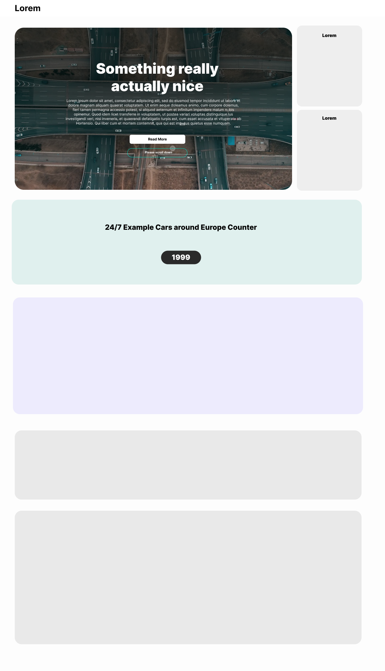
Example of such an layout
Template
Aplóe is still in heavy development, once it's mature enough, and gets a stable release, a template will be created to make it easier to start a project with Aplóe. The template will include all the necessary files and configurations to start a project with Aplóe, and it will be easy to customize and extend. The template will also include a basic example of how to use the components and styles provided by Aplóe. More information about the template will be provided once it's ready.
Contributors

Other Project Information
- It uses the Semantic Versioning system.
- It's licensed under the MIT License.
Roadmap
When all of the above tasks are completed, the project will get the release candidate status, and it will be ready for the first stable release.
The project is now in the release candidate status, and it's preparing for the first stable release. The project is now in the 1.0.0-rc.1 version.